I’m working on a project with a somewhat tricky analysis, and had hit a wall. I didn’t want to just figure the analysis out as I went, for fear of baking researcher bias into the results, but also wasn’t sure if the half-baked analysis would actually answer the question. Enter data simulation, a.k.a. something I should have done a long time ago.
Why simulate?
I can think of a few reasons off the top of my head, but the two that really hit home for me as a psycholinguist-phonetician are:
- a way to iron out the details of an analysis before you see the results, and
- get a much much better understanding of interpreting interactions between categorical parameters in mixed effects models.
The first reason is why I went down this rabbit hole, and second is the unexpected-but-extremely useful-and-important outcome that makes me want to play around with simulation more. Categorical variable coding is a post for another day, and hey, maybe it will feature data simulation! If you want more on that topic now, check out this fantastic AMLaP 2020 talk on why it’s Time to set your contrasts.
How to simulate?
There’s a few options. I’m focusing on R here. There’s the simstudy package, which I haven’t tried out yet, but was warned can be limited when dealing with complex structures. I have a complex structure, so I opted to just build the data using tidyverse-style code. In any case, the steps:
- How is the data structured?
- What parts are fixed? What parts would you like to be able to manipulate?
- Write code to build dataframe from scratch.
- Write code to visualize and test your fake data.
- And lastly, evaluate it. Does your analysis capture the baked-in pattern??
- Yes? Cool, move on to real data.
- No? Tweak the analysis and try again!
My very specific example R code
So in this simulation, I’m considering the relationship between how three different sounds are pronounced in two different languages by bilinguals. There may or may not be a relationship across languages, but there very likely is one within languages. I’m working on refining the analysis between the pilot stage of this project which I was supposed to present at ISBPAC 3 last year—Uniformity and crosslinguistic influence in Cantonese-English bilingual stops—but alas… covid.
In terms of the simulation, that means I need to be able to set up different configurations of within-individual, within-language structure, and then explore whether the proposed analysis can address the question I’m asking. Since this is a post that’s only focused on the simulation part, and there will be a paper coming eventually… I’ll only include the simulation bit here. It’s not exactly elegant code, but it does what I need it to.
So, you’ll want to start out by loading the tidyverse, and setting up some varible for how big of a data frame you want to generate. This is currently toy-sized.
library("tidyverse")

n_subs <- 10
n_obs <- 100 # per phone
Next up, build the data frame. This is set up to tweak individual language means, and then follows some basic aerodynamic constraints. The variable of interest here is (positive) Voice Onset Time, but could really be anything you want it to be.
df <- data.frame(subj = seq(1, n_subs, 1)) %>%
  mutate(
    subj_mean_a = round(rnorm(n(), mean=100, sd=10)), # set a mean for language A
    subj_mean_b = round(rnorm(n(), mean=subj_mean_a-10, sd=10)) # optionally set a mean for lang B
    ) %>%
  dplyr::slice(rep(subj, each = n_obs)) %>%
  mutate(
    # Language A
    p_A = round(subj_mean_a + rnorm(n(), -15, 10)), # p is usually shorter but not *always*
    t_A = round(subj_mean_a + rnorm(n(), 0, 10)), # t is in the middle but variable
    k_A = round(subj_mean_a + rnorm(n(), 15, 10)), # k is usually longer but not *always*
    # Language B
    p_B = round(subj_mean_b  + rnorm(n(), -15, 10)), # p is usually shorter but not *always*
    t_B = round(subj_mean_b  +rnorm(n(), 0, 10)), # t is in the middle but variable
    k_B = round(subj_mean_b  + rnorm(n(), 15, 10)), # k is usually longer but not *always*
    ) %>%
  pivot_longer(p_A:k_B, names_to='item', values_to='vot') %>% # pivot and set the column name
  separate(item, into=c('phone', 'language')) %>% # split item into informative columns
  mutate( # this is just in here to set things up for visualizing
    subj = as_factor(subj),
    phone = as_factor(phone),
    language = as_factor(language)
    ) %>%
  arrange(subj, phone)
And a resulting figure from one run showing density plots for each language and stop consonant. These are not R data viz defaults, but I usually set them globally so my figure code looks cleaner.
df %>%
  ggplot(aes(x = vot, color = language)) +
  geom_density() +
  facet_grid(phone ~ subj)
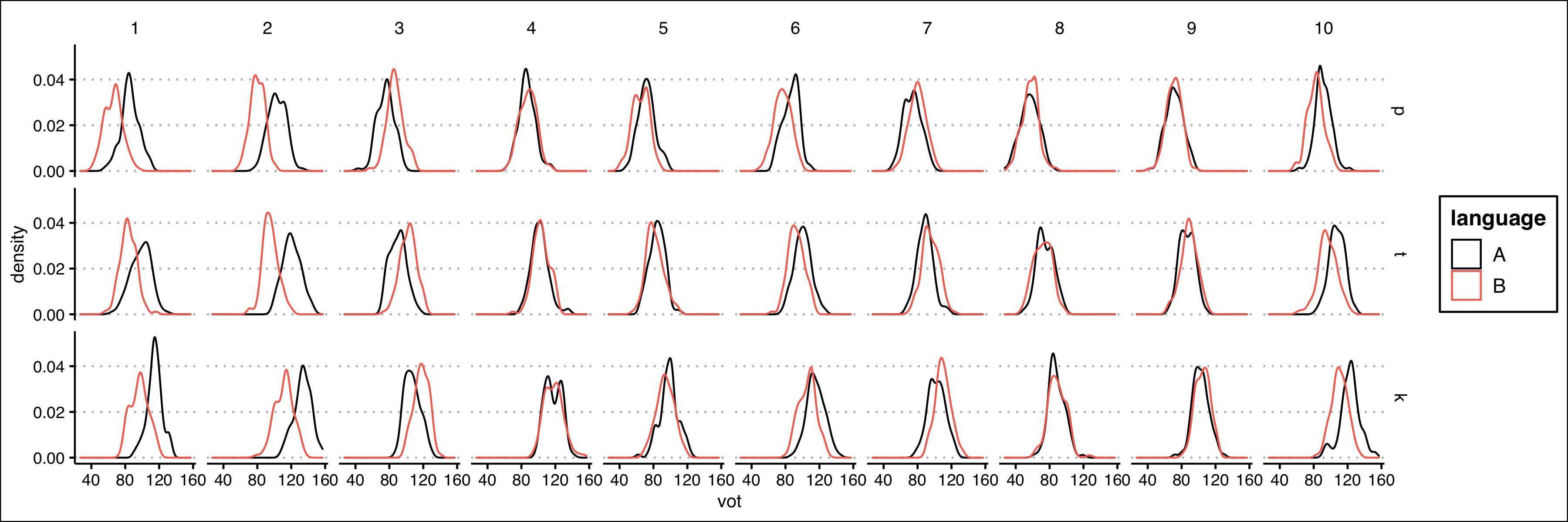
In this figure, you can see that when language B has a different VOT, it tends to be shorter, but isn’t always. You can also see that there’s a subtle p < t < k pattern. This was all baked in, but the visualization is a good check before moving onto testing out analyses.